EE
/
2020
The Problem
Split plans - where customers pay separately for their device and their airtime - had become standard across the mobile industry.
Internally, this wasn’t a new idea. EE had attempted to launch split plans multiple times over several years, but each effort stalled or was deprioritised. With regulatory deadlines approaching and competitor launches imminent, it became clear this could no longer be delayed.
The challenge wasn’t just delivery; it was making a complex, unfamiliar proposition feel understandable and beneficial to customers.
The Challenge
Position split plans as a positive change, not a cost increase or hidden restructuring
Ensure customers clearly understood what they were paying for, and why
Finally deliver the proposition end-to-end, avoiding another stop-start outcome
The Solution
Through extensive user testing and iteration, we realised this was less a visual design problem and more a psychology and communication challenge.
While the UI needed to be clean and intuitive, success hinged on clear, reassuring language and constant reinforcement of value. Customers needed to feel in control, not overwhelmed.
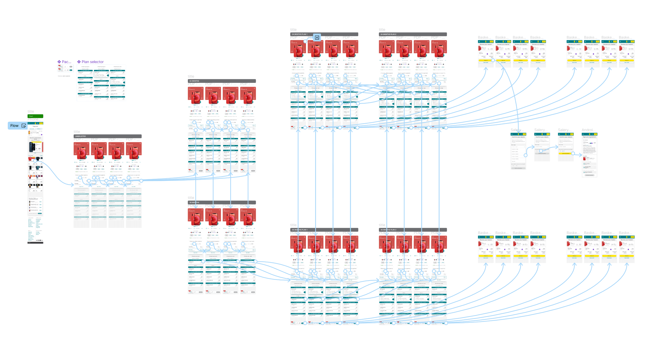
We designed a simple, step-by-step plan selection flow that:
Guided users through choosing a device and a plan separately
Clearly surfaced the total monthly cost at every step
Explained what that total was made up of whenever a change was made
This approach made it easier for users to compare options, understand trade-offs, and find a balance between what they wanted from their device and what they were comfortable paying each month.

The Results
Improved price clarity increased conversion
We reduced perceived complexity and made total cost of ownership clearer, supporting higher online checkout completion.Enabled higher-value upgrades without increasing churn
Device financing lowered upfront barriers to premium and 5G handsets, contributing to rising ARPU while monthly churn remained ~1%.Drove record direct-channel handset sales
The split-plan model integrated cleanly into EE’s redesigned checkout, helping EE achieve a record proportion of handset sales via its own digital channels (lower commission costs).Increased customer lifetime value through flexibility
Customers could upgrade devices independently of airtime, encouraging earlier device refreshes without losing customers at contract end.Supported family and multi-line growth
Airtime plans became easier to scale across households (shared data, multi-SIM discounts), reinforcing EE’s “families” positioning and boosting line additions per account.Created predictable, financeable revenue streams
Strong adoption of device finance allowed BT to securitise hundreds of millions in handset receivables, indicating material scale and commercial confidence in the model.
Split plans with EE
Understanding user psychology
Industry shifts and new regulation required EE to move away from traditional handset subsidies toward a split model, where devices are financed and plans are paid for separately.
Although this had become normal elsewhere, EE customers were used to a different mental model. Our task was not just to introduce a new pricing structure, but to reshape expectations around what upgrading a phone meant.
Visually, EE already had a mature design system in place. That allowed us to focus our efforts on communication, comprehension, and trust.
We aligned on several principles to guide the work:
Validate demand early using a fake-door test
Run continuous moderated and unmoderated user testing
Maintain close alignment with proposition managers and senior stakeholders

System and journey mapping
Despite sounding simple, split plans touched a large number of systems and journeys. To avoid adding friction, we mapped the full end-to-end experience, identifying:
Which steps were essential
Where complexity was unavoidable
Where language, not UI, was the real blocker
This allowed us to break the work into manageable parts and tackle the journey holistically rather than piecemeal.

The road to testing
Before any build work began, we tested multiple approaches to explaining the proposition. The goal was to ensure users:
Understood what was changing
Felt the change worked in their favour
Didn’t feel “locked in” or misled
We explored different structures, messaging styles, and framing techniques, learning quickly what resonated — and what didn’t.

Developing the designs
Each round of testing fed directly back into design. Sometimes this led to significant reworks; other times, a single word change dramatically improved comprehension.
This project reinforced just how powerful good content design can be. Clear writing often did more to reduce friction than additional UI elements ever could.
Teamwork makes the dream work
Alongside user testing, we relied heavily on internal critique. Product and content designers regularly reviewed work in progress, challenging assumptions and offering alternative approaches.
Using live FigJam sessions - with boards left open for async feedback - helped keep momentum while avoiding tunnel vision. Given the length and complexity of the project, this peer input was essential to staying on track.


Final Designs
By the end of our involvement, the journey had been simplified into something users could understand and navigate confidently. Testing showed that people grasped:
What they were paying
What they were getting
How their choices affected the monthly total
Even when users felt the prices themselves were high, they understood why - which was a meaningful shift from earlier confusion.


Takeaways
Although the project was paused again due to wider business change, it was completed after my departure and launched with updated branding in late 2023, with measurable effects on the wider business, including improved uptake of premium devices, good customer retention on upgrade, and influence on new lines in family plans.
Key learnings from the work:
Content really is king
Strong content design was critical to making this proposition work. Clear language transformed a complex system into something approachable.Peer feedback matters
Regular critique helped sharpen thinking, avoid dead ends, and maintain alignment across teams.Some problems require patience
This project benefited from a slower, more deliberate pace. After years of false starts, taking the time to validate, test, and communicate value was what finally enabled delivery.